
My Role: Research Lead, Client Liaison, Sketching, Wireframing, Prototyping, User Testing
Client: DCU FinTech Innovation Center
Timeline: 3 sprints over 4 weeks
Platform: Website Application
Software Used: Figma (Wireframing/Prototyping)
The Challenge
The Boston-based FinTech accelerator reached out needing an onboarding system for potential members. Easy enough. A few pages the user clicks through that educates them on DCU FIC’s strategy of pairing up-and-coming FinTech companies (startups) with banking and other industry professionals that want to give back (mentors). Done. But my team quickly found out the process wouldn’t exactly be that simple, and a certain global epidemic would only complicate it further.
Isn’t FinTech Just Blockchain & Crypto?

At least, that’s what I thought heading into this project. From the countless podcasts sent to me by friends, and the endless news articles telling me whether I should pay-in or pull-out of Ethereum, my knowledge of the industry was murky.
But DCU FinTech said they wanted an onboarding system, and that was something I knew plenty about. How different could this onboarding be from, say, an exercise app? You put in your information, boom, you got an account.
Immediately we discovered what set DCU FIC apart from the other accelerators in the region. While Techstars Boston and MassChallenge had slick websites, all their onboarding being routed through there, every new DCU FIC member was onboarded in-person, mostly met at networking events, and was introduced to the program over drinks or a meal, completely personable, like Mad Men or something.
My immediate reaction was charmed: how refreshing to have these person-to-person moments in a time where business is moving away from that. But then I realized we were having this meeting over Zoom. In our own houses. In quarantine. Because of COVID-19. And suddenly the reason we were brought in became much more obvious. This style of business, for better or worse, is on the way out, and we’re here to bring these sociable, real interactions into a digital space. Maybe not so easy.

I talked with Brandon, the Operations Manager at the Center, later that day, and when I asked him “isn’t FinTech just blockchain & crypto,” he laughed, obviously having heard this exact thing before.
“Whether you’re starting a family, long-term caring for your parents, starting a business, all these things have major financial implications, and people feel like they don't have a voice when it comes to their finances and their banking… you're working with an industry that is hundreds of years old, generally operating off of systems that are predating the millennium… there’s a level of distrust for something that's so impactful in your life, so something's got to give.”
Alright, fine, maybe it is more than blockchain and cryptocurrency.
DCU FinTech’s Userbase
After my talk with Brandon, we connected with 9 people for user interviews. All were specifically mentors, and after speaking with the Managing Director as well, I had a pretty clear image in my head as to who these mentors are.
We were looking at older individuals in a variety of financial fields, mostly banking, who want to support innovative startups, yet are typical tech-adverse, leading to the Center’s old-fashioned, in-person business style.
In this first round of user interviews, we sought to learn more about who we’re designing for (and see if that assumption was true), as well as get a run-down on the existing onboarding process at DCU FIC.
Questions included:
“How was your overall experience as a mentor at DCU FinTech?”
“What do you look for in a mentee?”
“What was the onboarding process like for you?”
“What’s your experience with the Center’s current website?”

All these interviews took place in Zoom over two days. I conducted three of them personally, and after all this, we had nearly seven hours of interview audio to comb through.
Something immediately struck me in my interviews: time is very important for mentors. They requested the interview questions prior, answered succinctly and thoughtfully, and made sure I got my answer before moving on. It threw me for a loop my first time, my casual California demeanor didn’t play well here.
But did this align with my team members’ research? After pulling data points from our respective interviews, we had dozens of pages of blurbs, so we decided an affinity diagramming exercise would suit us best. We were looking for patterns in these observations: to understand where our users conform.
Well What Do Mentors Need?
Using affinity diagramming, we found some shared beliefs amongst mentors. These were the most pronounced:
DCU FIC’s in-person, casual business model is appreciated, but it is seen as outmoded, especially in current times.
“I think the best onboarding you can do is by knowing the people who run the place and, you know, having a good relationship with them”
“A lot of this is kind of old fashioned. A lot of it is in informal emails that get a little lost.”
Website usage and engagement is low, stating it lacks interactivity or any relevant information, like how members can help the Center. Most members have visited only a couple of times, citing there’s nothing for them on it.
“When I go to the website, and I open up that page, I don't like the message...The message should be we have excellent companies that have been through here and have been really helped.”
Mentors agree that time is their highest priority.
“If there's chemistry and real value added, then the mentorship continues. But if not, I’m adamant about, you know, let's not waste anyone's time.”
In the end, we agreed that:
Time-conscious prospective DCU FinTech mentors need an intuitive & personable on-boarding process to facilitate mentor/mentee interactions because current methods are too onerous for the current DCU FIC staff.
At this point I recommended to the team 6-8-5 sketching, taking the information we have right now and trying to think of divergent solutions for the problem, no matter how small or big-picture they are, wacky or grounded. But it can be a little difficult for a handful of UX designers to ideate concepts that disparate from each other, we all have this shared industry knowledge after all, so I invited DCU FIC in to diversify our thinktank.

1) A typical, three-page flow where users would input their data, after which they’re placed into a simplified dashboard where they can correspond with and receive basic information from an AI Chatterbox (using tech supported by DCU FinTech years prior).

2) An onboarding inspired by sites like care/of or even TurboTax, where users are asked one simple question per page to limit cognitive overload, and then are directed to a dashboard closer to LinkedIn.

3) Introduced by a DCU FIC’er, this takes users through a journey: introducing what set DCU FinTech apart, shows some startups, asks the user if this is something they’re interested in (“a fork in the road”), where then they can register, replacing that initial in-person meeting.
It’s kind of the reverse of when Wittgenstein said “if a lion could talk, we wouldn’t be able to understand it.” I don’t share much in common with the folks who work at DCU FinTech, or even the fellow designers on my team, but that’s essential to ideation, and the entire design process. The unique, individual human experience we all carry with us will introduce completely one-of-a-kind discoveries that when combined and contrasted, can create dynamic, all-encompassing solutions.
So we began wireframing, all in Figma, so we could quickly see how each other were doing. I took the lead on “the journey” concept, and we all began on our lo-fi wireframes.

"The Journey" splashpage, leading with talking-up the accelerator, something many mentors felt was missing from the current site.

Broad and brief description of DCU FIC and it's focuses.

Links to some of DCU FinTech's finest.

The fork in the road, and the beginning of a Q&A style onboarding.
I used the familiarity of a pitch deck as a jumping off point, effectively “selling” prospective members on DCU FinTech as they’d flip through these brief pages. I was interested in moving forward into user testing with this concept to act as a control group: it was inspired by the client’s ideation, and we’ll get to see how it aligns with the users.
The other concepts included a pretty standard onboarding process followed by the AI Chatterbox:

And the final concept used the failproof care/of or TurboTax flow, a very focused amount of information per screen that hopes to emblemize the casual, natural “talk over drinks” feeling DCU FinTech is known for.


Is This What Mentors Need?
Our team reached out to 5 mentors, different than the last group, and scheduled a time for concept testing over a 3 day period. Test participants were asked to think out loud as they made their way through each prototype, and were asked debrief questions after each concept.
Questions included:
Was there anything you liked about the concept?
Was there anything you disliked about the concept?
Was there anything you would change or add?

In my interviews, the strategy of limiting the cognitive load by having less information per page completely backfired, with the mentors stating they much preferred the Chatterbox concept with the more traditional information input. It was familiar, and it felt much faster since there were way less clicks involved.
The rest of the team got similar feedback, which was compiled into a three column affinity diagram. Each column was a different concept, and similar notes were paired, pairs were made into groups, it was just like last time.


Taking in the pros and cons of each concept, the team made a priority matrix to decide what will be best included in the final concept.
Anything in the bottom right quadrant makes sense to be included, it’s easy to implement and it’s important to our users. Top right is where it gets a little fudgy, we’ll see what we can do, but those features may be too time-consuming for our agile process (see Moving Forward).
Now This Must Be What Mentors Need

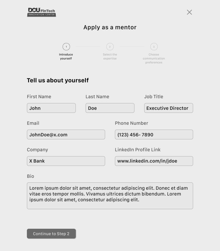
Our converged concept begins with a slightly redesigned home page, recalling users’ stated lack of involvement or enjoyment using the DCU FinTech website. The Center’s accomplishments and member stories are brought to the front, promoting how successful their startups have been. Additionally, the once-missing sign-in and apply buttons have been added to the nav bar, which leads to…

… a three-page, comprehensive onboarding with a progression tracker, something mentors stated in necessary to budgeting their time. Once they’re done, they’re dropped into…

… a dashboard focused on facilitating communication, using features like shared calendars to schedule meetings, roundtables to share advice and experiences with fellow mentors, or an activity feed for the mentor’s mentees. The aim is for this to more so be about maintaining and strengthening existing relationships, rather than making new connections.
The concept fared rather well in testing, with users saying they enjoyed the simple, intuitive onboarding and many of the features, with the biggest areas of improvement being adding more features. Users pitched a “gentle reminder” feature for upcoming events, and even an introductory video as to what it’s like being a DCU FIC mentor.
Moving Forward
Ultimately, the mentors are a diverse user base, contrary to initial assumptions. Despite being a rather niche group (finance industry professionals in the Boston area), they have a pretty diverse set of wants and needs.
Now that it’s in DCU FinTech’s hands to put in place, our recommendations for them are to use language more familiar to the FinTech community and their members, and further testing if/when more engaging features (reminders, video, etc.) are realized.
What Did I Learn
No matter what information or assumptions you’ve had prior, you never really know what the users are like until you sit down with them.
On top of that, every day is different for everyone. They could be having a great day or a terrible day, countless factors affect their disposition which shouldn’t be presumed.
What you deem as a solution very well could not be a solution to the users, and as always, the research should be the force behind these decisions.
I believed a faster and simpler process would be one that broke up the information into digestible chunks, but resoundingly disagreed. In retrospect, of course they would want to use a format they’re used to.
Diversity, in every way imaginable, is integral to successful ideation.
Not only is a varied team makeup of designers necessary, but ideation can be entirely overhauled by bringing in people of completely different occupations and totally different experiences. These perspectives will provide insight you couldn’t imagine.